Note: While the techniques outlined in this article are still applicable, the iOS design landscape has changed since iOS 7, making a lot of them superfluous. If you want to take a fresher look at designing a custom iOS button using Xcode and Swift, check out the new Building iOS Interfaces series.
Regardless of the platform you are designing for, getting familiar with its technologies and frameworks is key to refining your design process; even a basic understanding of the technical environment and its constraints can help you streamline the transition from Photoshop comps to design implementation, or completely bypass the former where appropriate.
In this tutorial, we’ll cover four techniques of varying levels of difficulty to draw a custom UIButton, the primary button class in iOS. If you are just getting started, I recommend reading Mike Rundle’s introduction and giving these tutorials a go to get a more hands-on experience.
Setup
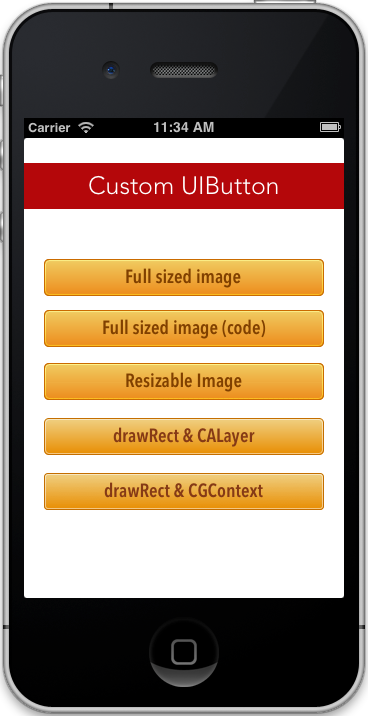
Start by creating a single view application in Xcode using Apple’s default
settings. In the file navigator, select MainStoryboard.storyboard then
drag-and-drop a Round Rect Button from the bottom-left objects library to the
view canvas. Center the button in the canvas and resize it to your liking, then
make few copies of it as shown in the screenshot below.
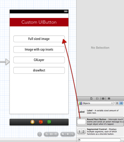
Make sure to choose the label font and color using the Attribute inspector in the right-hand side of the Xcode window.
Painting Pixels
The most common and straightforward approach consists in using background images to customize the stock UI controls provided by Apple.
Full-sized Assets
Difficulty: ★☆☆☆☆
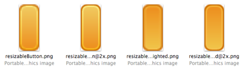
The first option involves using a full-sized graphic as the background of your UIButton instance. To do so, design the button (normal and highlighted states) in your favorite graphic editor then export the assets as uncompressed PNGs in both standard and double resolutions.
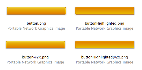
Import the images to your project by dragging them into the File navigator.
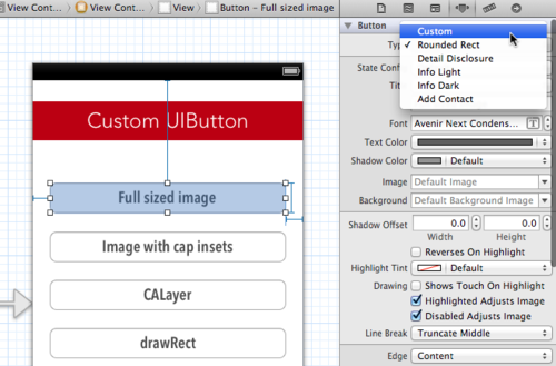
In Interface builder, change the button type to custom in the top-right
Attributes Inspector.
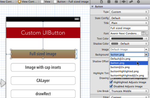
Then add your images as backgrounds for both the default and the highlighted states using the drop-down shown below.
You can also set background images in code by control-dragging your button to
the @interface section of the main view controller as an IBOutlet:
@property (weak, nonatomic) IBOutlet UIButton *fullSizeImage;
… then calling the setBackgroundImage method inside viewDidLoad for each
state:
- (void)viewDidLoad
{
    [super viewDidLoad];
    [self.fullSizeImage setBackgroundImage:[UIImage imageNamed:@"button.png"] forState:UIControlStateNormal];
    [self.fullSizeImage setBackgroundImage:[UIImage imageNamed:@"buttonHighlighted.png"] forState:UIControlStateHighlighted];
}
It is worthing noting at this point that anything drawn in code is not
previewable in Interface builder. Run the app on the iOS simulator by hitting
cmd+R to see the result.
Advantages of full-sized assets
- Absolute creative freedom.
- No coding prerequisites if using Interface Builder.
Disadvantages of full-sized assets
- Larger app bundles.
- Less reusable across the app (size-constrained.)
- Even minor edits require re-exporting the assets.
Resizable Assets (iOS 5+)
Difficulty: ★★★☆☆
A recently introduced second option consists in using a resizable image as a button background after having set its resizable and non-resizable areas in code. Start by making a pill-shaped background image in your graphic editor.
Next, you should instruct Xcode what areas should be stretched to fit the
dimension of the button. For instance, you can prevent the four corners of the
background image from being stretched using cap insets. To see this in
action, import the assets into Xcode and create a resizable image object to be
used with setBackgroundImage (inside viewDidLoad):
UIImage *resizableButton = [[UIImage imageNamed:@"resizableButton.png" ] resizableImageWithCapInsets:UIEdgeInsetsMake(17, 5, 17, 5)];
UIImage *resizableButtonHighlighted = [[UIImage imageNamed:@"resizableButtonHighlighted.png" ] resizableImageWithCapInsets:UIEdgeInsetsMake(17, 5, 17, 5)];
The UIEdgeInsets argument takes four floats corresponding to the distance (in
density-independent pixels) separating the caps from each side of the image in
the following order: top, left, bottom, right.
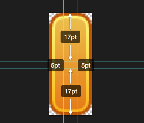
For the sake of clarity, the center area in the example above is much wider than it should actually be. In most cases, a 1pt stretchable area is what you should be aiming for.
Unlike full-sized images, setting a resizable image as a background can only be done in code (same steps as the previous method):
// Drag-and-drop the UIButton instance to the @interface section of your view controller
@property (weak, nonatomic) IBOutlet UIButton *resizableImage;

// Inside viewDidLoad
[self.resizableImage setBackgroundImage:resizableButton forState:UIControlStateNormal];
[self.resizableImage setBackgroundImage:resizableButtonHighlighted forState:UIControlStateHighlighted];
In iOS 6, Apple updated the resizableImageWithCapInsets method to accept a
resizingMode argument that explicitly instructs Xcode which of the two
available resizing modes to use: tiling or stretching. When unspecified, the
former is used.
Advantages of resizable assets
- Lighter app bundles.
- Reusable assets across the app.
Disadvantages of resizable assets
- Edits involve re-exporting the assets and might involve resetting the cap insets as well.
Unleash the CALayer Within
Difficulty: ★★★★☆
Update: The code in this technique has been refactored for better performance with the help of Joris Kluivers.
The CALayer (Core Animation layer) object is the fundamental drawing unit
in iOS; a view draws itself into its layer before this latter appears on
screen. You’d be surprised at how much you can accomplish without having to
draw a single pixel in Photoshop.
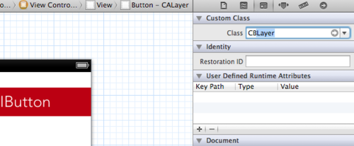
First, we need to create a UIButton subclass where our drawing code will end
up. Hit cmd+N and create a new Objective-C class by subclassing UIButton.
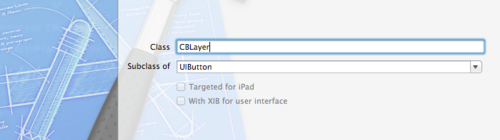
In Interface builder, set the class of the target button to CBLayer (or
whatever you named your subclass) using the top-most field in the Identity
inspector.
Go back to the implementation file of your custom button class (.m extension)
and implement initWithCoder, a method that will get called on our button
instance in order to unarchive it when the view loads. Between the
@implementation and the @end directives:
- (id)initWithCoder:(NSCoder *)coder
{
    // Our custom CALayer drawing will go here
}
To better organize our code, we’ll split the different parts of the button
(background, border, inner-glow, etc.) into separate properties and drawing
methods, then call each from within initWithCoder. To do so, we’ll start by
declaring the properties that will be used in this process above the
@implementation directive:
@interface CBLayer ()

@property (strong,nonatomic) CAGradientLayer *backgroundLayer, *highlightBackgroundLayer;
@property (strong,nonatomic) CALayer *innerGlow;

@end
We’ll implement four instance methods (a message that can be sent to a single
button instance) to take care of drawing the button and setting its properties.
Whenever using CALayer, remember to link the QuartzCore framework in the
Build phases tab of the project manager:
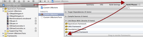
You’ll also need to import its header file in your subclass using this
directive #import.
Let’s start by drawing the button itself:
- (void)drawButton
{
    // Get the root layer (any UIView subclass comes with one)
    CALayer *layer = self.layer;

    layer.cornerRadius = 4.5f;
    layer.borderWidth = 1;
    layer.borderColor = [UIColor colorWithRed:0.77f green:0.43f blue:0.00f alpha:1.00f].CGColor;
}
For the gradients, we’ll use the CAGradientLayer subclass made specifically
for this purpose:
- (void)drawBackgroundLayer
{
    // Check if the property has been set already
    if (!_backgroundLayer)
    {
         // Instantiate the gradient layer
        _backgroundLayer = [CAGradientLayer layer];

        // Set the colors
        _backgroundLayer.colors = (@[
                                   (id)[UIColor colorWithRed:0.94f green:0.82f blue:0.52f alpha:1.00f].CGColor,
                                   (id)[UIColor colorWithRed:0.91f green:0.55f blue:0.00f alpha:1.00f].CGColor
                                   ]);

        // Set the stops
        _backgroundLayer.locations = (@[
                                      @0.0f,
                                      @1.0f
                                      ]);

        // Add the gradient to the layer hierarchy
        [self.layer insertSublayer:_backgroundLayer atIndex:0];
    }
}
The highlighted state gradient can be set using a separate -
(void)drawHighlightBackgroundLayer method that is identical to the one above,
save for he color values. To DRY up your code, it is recommended that you move
the layer drawing code to a separate
-(void)drawBackgroundLayerWithGradient:(NSArray)colors method.
Next, we will implement an instance method to set the _innerGlow property:
- (void)drawInnerGlow
{
    if (!_innerGlow)
    {
        // Instantiate the innerGlow layer
        _innerGlow = [CALayer layer];

        _innerGlow.cornerRadius= 4.5f;
        _innerGlow.borderWidth = 1;
        _innerGlow.borderColor = [[UIColor whiteColor] CGColor];
        _innerGlow.opacity = 0.5;

        [self.layer insertSublayer:_innerGlow atIndex:2];
    }
}
If we build and run the app at this stage, only the label will be visible on
the button. To get our layers onto the screen, we need to call the layer
methods from within initWithCoder.
- (id)initWithCoder:(NSCoder *)coder
{
    // Call the parent implementation of initWithCoder
  self = [super initWithCoder:coder];

    // Custom drawing methods
  if (self)
    {
    [self drawButton];
        [self drawInnerGlow];
        [self drawBackgroundLayer];
        [self drawHighlightBackgroundLayer];
  }

  return self;
}
That doesn’t seem to be enough though; we also need to set the frame rectangles
of our different layers and update them every time the button is tapped by
implementing the layoutSubviews method:
- (void)layoutSubviews
{
  // Set inner glow frame (1pt inset)
  _innerGlow.frame = CGRectInset(self.bounds, 1, 1);

  // Set gradient frame (fill the whole button))
  _backgroundLayer.frame = self.bounds;

  // Set inverted gradient frame
  _highlightBackgroundLayer.frame = self.bounds;

  [super layoutSubviews];
}
Hit cmd+R to see our layers in action. We’ve got one little problem though:
the button looks constantly pressed (highlighted) and does not visually react
to user taps. Having a closer look at the code, the former appears to be a
direct result of calling drawHighlightBackgroundLayer which draws the
inverted gradient with a higher z-index (see insertSublayer:layer
atIndex:index). To fix this, we need to initially hide the alternate
background and make it only visible when the button is tapped. Inside
initWithCoder, we’ll add the following line below our drawing methods:
_highlightBackgroundLayer.hidden = YES;
Then we’ll implement setHighlighted, a method that gets called whenever a
UIButton is tapped:
- (void)setHighlighted:(BOOL)highlighted
{
    // Hide/show inverted gradient
  _highlightBackgroundLayer.hidden = !highlighted;

  [super setHighlighted:highlighted];
}
When using CALayer, properties are animated by default (cross-fade in this
case). We can disable the implicit animation inside setHighlighted:
- (void)setHighlighted:(BOOL)highlighted
{
  // Disable implicit animations
  [CATransaction begin];
  [CATransaction setDisableActions:YES];

    // Hide/show inverted gradient
  _highlightBackgroundLayer.hidden = !highlighted;

  [CATransaction commit];

  [super setHighlighted:highlighted];
}
With this we are good to go. One last thing that you may want to do is override
the UIButton method buttonWithType in order to prevent inconsistent results
if the button is instantiated in code.
+ (CBLayer *)buttonWithType:(UIButtonType)type
{
    return [super buttonWithType:UIButtonTypeCustom];
}
Advantagesof CALayer approach
- No graphics.
- Reusable and expandable code.
- Easily editable.
- Transitions are animatable.
Disadvantages of CALayer approach
- Difficulty to obtain certain effects such as inner shadows and glows.
- Occasional gradient banding (often on darker gradients).
- Resource hungry.
Bezier Paths and Beyond
Difficulty: ★★★★★
In this last method, we will be using drawRect (base custom drawing method in
iOS) and Core Graphics to design our custom button in code.
Go ahead a create a new UIButton subclass then assign it to a button instance
in Interface builder. All the code below should go inside drawRect.
We’ll start by defining the color space and the graphics context, a blank canvas where our custom drawing will take place.
// General Declarations
CGColorSpaceRef colorSpace = CGColorSpaceCreateDeviceRGB();
CGContextRef context = UIGraphicsGetCurrentContext();
Next, we will define the colors and the gradients that will be used throughout our implementation:
// Color Declarations
UIColor *borderColor = [UIColor colorWithRed:0.77f green:0.43f blue:0.00f alpha:1.00f];
UIColor *topColor = [UIColor colorWithRed:0.94f green:0.82f blue:0.52f alpha:1.00f];
UIColor *bottomColor = [UIColor colorWithRed:0.91f green:0.55f blue:0.00f alpha:1.00f];
UIColor *innerGlow = [UIColor colorWithWhite:1.0 alpha:0.5];

// Gradient Declarations
NSArray *gradientColors = (@[
                           (id)topColor.CGColor,
                           (id)bottomColor.CGColor
                           ]);

CGGradientRef gradient = CGGradientCreateWithColors(colorSpace, (__bridge CFArrayRef)(gradientColors), NULL);

NSArray *highlightedGradientColors = (@[
                                      (id)bottomColor.CGColor,
                                      (id)topColor.CGColor
                                      ]);

CGGradientRef highlightedGradient = CGGradientCreateWithColors(colorSpace, (__bridge CFArrayRef)(highlightedGradientColors), NULL);
For the rounded rectangle shapes, we will be using UIBezierPath‘s
bezierPathWithRoundedRect class method.
// Draw rounded rectangle bezier path
UIBezierPath *roundedRectanglePath = [UIBezierPath bezierPathWithRoundedRect: CGRectMake(0, 0, 280, 37) cornerRadius: 4];
// Use the bezier as a clipping path
[roundedRectanglePath addClip];

// Use one of the two gradients depending on the state of the button
CGGradientRef background = self.highlighted? highlightedGradient : gradient;

// Draw gradient within the path
CGContextDrawLinearGradient(context, background, CGPointMake(140, 0), CGPointMake(140, 37), 0);

// Draw border
[borderColor setStroke];
roundedRectanglePath.lineWidth = 2;
[roundedRectanglePath stroke];

// Draw Inner Glow
UIBezierPath *innerGlowRect = [UIBezierPath bezierPathWithRoundedRect: CGRectMake(1.5, 1.5, 277, 34) cornerRadius: 2.5];
[innerGlow setStroke];
innerGlowRect.lineWidth = 1;
[innerGlowRect stroke];

// Cleanup
CGGradientRelease(gradient);
CGGradientRelease(highlightedGradient);
CGColorSpaceRelease(colorSpace);
In order to get our button to change appearance when highlighted, we’ll have to
force drawRect to be called whenever the button is tapped. This can be done
through calling setNeedsDisplay inside setHighlighted:
- (void)setHighlighted:(BOOL)highlighted
{
  [self setNeedsDisplay];
  [super setHighlighted:highlighted];
}
If you are not inclined to learn Core graphics and are willing to fork $99, you
can use PaintCode, a “graphic editor” that
generates the drawing code to go inside drawRect.
Advantages of Bezier approach
- Same as
CALayer. - More creative freedom.
Disadvantages of Bezier approach
- Gradient banding.
- Can get unwieldy pretty quickly.
Get the demo app here.
Update: Andy Matuschak, a member of the UIKit team, was kind enough to point out in this article’s HN thread that these techniques have different performance ramifications. This is will be most certainly the topic of a future article.
Conclusion
Apple provides different ways to customize the look and feel of your iOS apps, and it’s only getting better with each major iOS release. Learning Objective-C and Core graphics is sure daunting for many designers, but it may be worthwhile considering how it can empower you and help you become more efficient on the long run.
What’s next
If you found this useful, you might also enjoy: