When it comes to designing dashboards for web applications, people often turn to dials as a way of representing a single data point that fluctuates over time. Think of a speedometer in a car.

It’s easy to glance down and get the current speed on a car dashboard while driving and navigating traffic. Dials work well in this context: we only care about the current speed and the direction the speed is going. When we need to slow down, we press down on the brake and can see our needle moving downwards. The speedometer tells us if we’re slowing down fast enough, and if we’re not, we adjust our braking so the needle moves at the right pace.
When we’re monitoring our applications, our dashboards tracking our application metrics should work the same way. We should be able to know what’s wrong with our app at a glance and respond quickly. Because people often want to replace a familiar analog interface on the computer screen, dials in dashboards are popular.
Dials don’t work the same way on your computer screen. Let’s look at Google Chart’s “gauge” visualization.
These gauges are mostly grey with some red and orange to represent critical and warning ranges. If our metric goes into these ranges, we should start reacting.
But our eyes are attracted to colors of greatest contrast: the red and orange blocks. Every time we look at a dashboard with these dials, we see the areas of bright colors, even when nothing is critical. This may not be a big deal with one gauge, but dashboards display many other metrics. Things get messy when we have several graphs on a page.
Consider the following set of dials:

Does it look much different from the following set of dials?
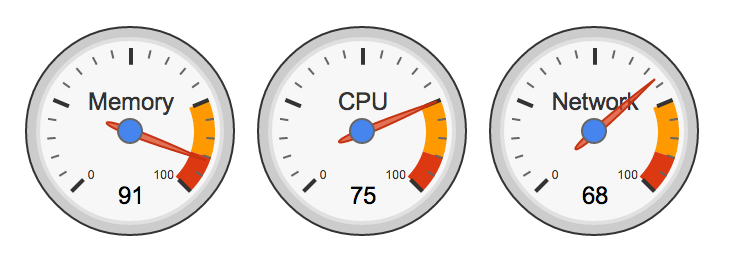
The second set of dials some values that are barely in the critical and warning zones. What if you had 10 other graphs on your dashboard? Would you be able to notice a critical metric in one glance?
Alternatives
A popular solution is to eliminate the extra “ink” around the dial and fill the current value up to its appropriate pixel value.

This is a sleeker dial that doesn’t need labels and dashes. If the designer chooses, the color of the dial can change to reflect the state of the value. For example, if the current value is critical, the dial could turn red.
This display is an improvement on the analog dial design for our web dashboards. If we need to display several single values, we still lose a lot of screen real estate to the circular shape. Instead, we can use a bullet chart, a dial alternative designed by Stephen Few.
We can display three metrics for a lot less space, and we can see where those current values land in their ranges.

Few avoids common “status” colors like red, green, and yellow when he can to reduce the number of contrasting, attention-grabbing colors on the page and to account for color blind users. In this graph, the attention grabbing color is reserved for metrics that hit the critical range.
The downside is that this type of visualization often requires explanations for the people who are viewing them. If you want to display a current value with a little bit of history and ranges, sometimes a simple line graph with a few annotations does the trick.

While this metric isn’t in a critical range yet, we can quickly see that it’s rapidly approaching that critical value and should probably take action to resolve that.
Dials are a great way to display analog information, but it’s important to keep in mind that they work differently in a dashboard on your screen. Depending on the situation, some of these examples will be a better alternative.
If you’re interested in learning more about maximizing the effectiveness of your dashboards, I highly recommend the writings of Stephen Few.