Bourbon Neat—or Neat for short—is a lightweight, open source fluid grid framework built on top of Sass and Bourbon with an emphasis on flexibility and ease of use. The framework comes with sensible defaults and useful mixins to help get both developers and designers up and running in minutes.
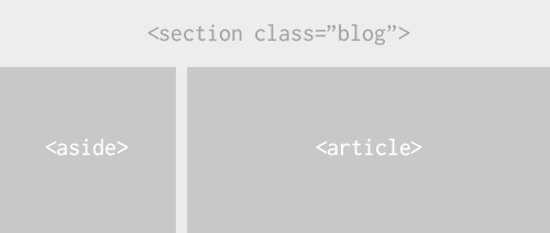
For instance, applying a grid-based layout to this markup…
<body>
 <section class="blog">
  <aside></aside>
  <article></article>
 </section>
</body>
…is only two mixins away:
section.blog {
  @include outer-container;

  aside {
    @include span-columns(4);
  }

  article {
    @include span-columns(8);
  }
}
And the result would be:
Here are some live examples of what you can build with Neat.
Why another grid framework
We built Neat with the aim of promoting clean and semantic markup; it relies
entirely on Sass mixins and does not pollute the HTML with presentation classes and extra wrapping divs.
It is less explicit—as in requires fewer mixins—than most other Sass-based
frameworks and comes with built-in table-cell layout support.
The main motivation behind Neat is allowing anyone to build fluid, entirely semantic grid layouts without having to wade through hundreds of lines of documentation. We also believe that giving designers the ability to override the default behavior without hassle is key.
Getting Started
To start using Neat in one of your existing projects, place the /neat
directory in your main stylesheets folder and make sure you have Bourbon
installed. Import both
mixin libraries in this order:
@import "bourbon/bourbon";
@import "neat/neat";
Although not required, you are welcome to override the default settings, namely
$grid-columns and $max-width, by redefining them in your site-wide
_variables.scss and importing it before Neat:
@import "bourbon/bourbon";
@import "variables";
@import "neat/neat";
Ruby Gem
For Rails apps, use the gem instead. In your
Gemfile :
gem 'neat'
After running bundle install you will be able to use Bourbon and Neat
together.
If you get this error:
Bundler could not find compatible versions for gem "sass"
Run:
bundle update sass
Within your application.css.scss file place the following:
@import "bourbon";
@import "neat";
Neat is fully responsive
Using Sass 3.2 block mixins, Neat makes it extremely easy to build responsive
layouts. The breakpoint() mixin allows you to change the total number of
columns in the grid for each media query. You can store these values in
project-wide variables to DRY up your
code:
$mobile: max-width 480px 4;
When used as a breakpoint() argument, $mobile instructs Neat to use
a 4 column grid in mobile-size viewports:
.my-class {
  @include breakpoint($mobile) {
    @include span-columns(2);
  }
}
Would compile to:
@media screen and (max-width: 480px) {
  .my-class {
    display: block;
    float: left;
    margin-right: 7.42297%;
    width: 46.28851%; // 2 columns of the total 4
  }

  .my-class:last-child {
    margin-right: 0;
  }
}
Feel free to refer to the
documentation for more on
how to use breakpoint() and all the other mixins. Don’t forget to check out
the examples for some inspiration.
Now go get Neat and build something awesome.