Early graphical user interfaces and operating systems were limited by their processors and displays. During these early days, monitors with a resolution around 800x600 pixels and less than 256 colors were the standard. This created an aesthetic that had few colors, less clutter, and simple controls. Although designers at the time did look to minimalist design for inspiration, that was largely out of necessity. These interfaces also had to be simple because so much of it was new. To make people comfortable with their new computers, it would have to be presented in a way they understood.
Skeuomorphism is a design concept used to take advantage of these affordances, creating digital imitations of the things users interact with every day. Individual items that mimic the real world are called skeuomorphs. The entire desktop metaphor was a skeuomorphism. By using skeuomorphs like “files”, “folders”, “windows”, and even “buttons”, we create helpful metaphors that people can relate to.
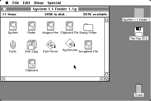
This method works well and as technology improved it continued to work even better. Computer displays are now so detailed that you can’t see individual pixels with the naked eye. Our digital interfaces are capable of producing nearly the same color and detail (in two dimensions) as their real-life counterparts. People have also become accustomed to digital versions of real-world interfaces like buttons, sliders, folders, and pagination. These design patterns are so successful because people have built up a lifetime of affordances by interacting with physical things, and some of those ideas are difficult to change.
“This looks like a toggle that I can turn off”.
“This other thing looks like a dial that I can rotate”.
“This looks like a piece of paper that I might be able to push out of the way.”
Designing user interfaces is a balance between clever new solutions and familiar proven ones. Every tried-and-true interface element was once novel, but they often use affordances to push a metaphor and introduce new concepts.
Things like popovers, text inputs, and breadcrumbs aren’t skeuomorphs because they don’t quite have a direct analog in the real world. They instead represent simple and logical levels of information and don’t have a lot of interaction to them. Skeuomorphs aren’t really needed in these cases. If you can get away with using a plain solution, then it should take a very good reason not to use it. Some concepts are implicitly complicated and a visual clue can make them seem simpler.
Using Skeuomorphs
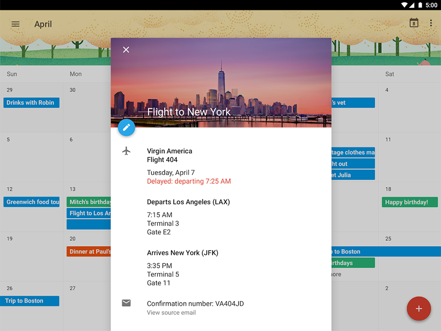
Let’s take a look at some ways to use skeuomorphs to gain a shortcut to familiarity. If you are designing a calendar, it’s helpful for the user if you present your digital calendar similar to a typical wall calendar that they are already know. Use monthly grids of seven columns. Adding details like paper edges and leather accents can make it immediately apparent what the user is looking at and how to use it. They might be able to view another month by swiping the page away or tapping on a date to make a new calendar entry. These details are hints to the user and let them skip an onboarding process by mimicking the kinds of interfaces that already surround them.
Be a lazy designer! Borrow from the world around us rather than reinventing what already exists and works well.
Another simple example is the “Web 2.0” glossy button. It looks outdated now, but it was so popular because it worked. The three-dimensional effect implied that the user could touch and interact with it, inviting them to click. You may see draggable elements with “ridges” to imply the same thing. Drop shadows can be used to suggest that the element is distinct and separate from its background and should be thought of as a self-contained item.
More complicated skeuomorphisms go for a bolder approach, attempting to be completely realistic. Early versions of Apple’s iOS are probably the most famously ambitious of these. The icons and many other elements had a glossy overlay for a consistently bubbled appearance. The Newsstand app for magazine content looked like real shelves. The Notes and Contacts apps also used leather and paper textures to look as much like their counterparts as possible.

On the web, these trends had been the norm for several years. CSS had finally progressed to the point where layout and complicated textures could copy the popular style of Print Design that many web designers had come from.
Skeuomorphism Is Dead
Interfaces full of gradients, shadows, and glossy overlays distract from the actual content. If the user has difficulty separating style from content, they will become frustrated and leave your app. The extra processor power that these elements required could also make some devices sluggish and performance began to suffer. Responsive Web Design began to gain traction and scaling the complicated styles of skeuomorphism was extremely difficult. Some people thought these styles were too extravagant or even gaudy. For all of these reasons, the pendulum began to swing the other direction.
It’s important to remember that interface design is very different from artistic expression. The function of the application is the most important thing, and an interface is only beautiful if it helps you do that thing effectively. Designers began to shift away from skeuomorphism, toward minimalist interfaces without notions of physical properties.
Many designers drew inspiration from art and design movements like modernism, Swiss style, and Bauhaus. These 20th century design movements focused on simplicity, typography, and hierarchy. Shadows dropped to the flat background, and gradients were replaced by bold colors. Type grew larger and typefaces became a central part of the design. These art movements were trying to find a universal aesthetic, one that belonged to the whole world and put people first, a philosophy that fits the web perfectly.
One of the early champions of flat design on the web was Microsoft. This was a surprise to some because they had been one of the worst offenders with the visual style in Windows 7. In some themes, nearly every element was shiny, translucent and had a gradient (and of course a shadow behind it, too). When Windows 8 was released in 2012, they went in an entirely different direction and relied heavily on big flat “tiles”. Users hated some of the interaction changes, but the visual style was generally well received and other systems suddenly looked out of fashion.

Apple was simultaneously working on a similar approach for its operating system for phones and tablets. Abstraction replaced the extreme realism and a “flat” design language was created. The elaborate textures were gone. Typography and whitespace became the center of a new pattern library and consistency between apps made the entire ecosystem cohesive and interactions more predictable.

On the web, things had been moving this direction for a few years already, but the influence of these mobile operating systems spilled into web design. The collective experimentation and concurrent focus on design languages benefited the larger ecosystem of web and native apps in a way that hadn’t happened before.
It was a chaotic few years, but it finally felt like we were coming from the same place and with a common purpose. It was time to figure out the next step. I called the move toward abstraction a “pendulum” earlier because what came next was a swing back in order to take from the best of both worlds.
Long Live Skeuomorphism
Many people describe flat design as being “clean and simple” and skeuomorphism as unnecessary decoration, but that kind of thinking misses the point. The goal of design is not simplicity, but efficiency. An effective interface will be free of unneeded embellishments, but will also use affordances to its advantage, which may include skeuomorphs.
“Minimalism is a process, it’s not an aesthetic.” — Anthony Casalena, Founder & CEO of Squarespace
Like any trend, the move toward minimalism has gone too far in some cases. When Apple redesigned iOS for version 7.0, many users felt that the changes were confusing and important visual clues for interaction were lost. Elements were collapsed where the depth was needed to separate context. Buttons no longer felt touchable and were difficult to distinguish from non-interactive elements around them. Things have improved in subsequent releases, but it hasn’t been a painless process to find the right balance.

Continuing this trend, Google benefited from watching the stumbling of Microsoft and Apple and they shortly followed up with a well balanced approach on mobile that quickly spread to their web products with a design language dubbed \“Material\”. At first glance it looks just as flat as Microsoft’s and Apple’s offerings, but Google focused on depth and motion as important visual cues that work well in native apps and on the web.
We’re taking all of those things and we’re trying to put them together to build a set of rules that’s timeless, in the same way that the rules of filmmaking or graphic design are also timeless
— Google designer Matías Duarte
Combining the successful elements of abstraction and skeuomorphism allows us to craft our branding on a spectrum, just like we would do for color, typefaces, or iconography. It was a tumultuous time for design for apps of all kinds, but I think we’re coming out of that debate with a much stronger approach to building design languages. Dogmatic clinging to one extreme or the other benefitted no one, especially the users, and a renewed focus on how people interpret the systems and work with their affordances will help us build a better web.
So will skeuomorphism ever go away? We should all hope not.