In The Visual Display of Quantitative Information, Edward Tufte calls Minard’s graphic of Napoleon in Russia one of the “best statistical drawings ever created.” But what makes it so good?
Before we analyze this graphic, we need to know a bit of history.
The year is 1812, and Napoleon is doing pretty well for himself. He has most of Europe under his control, except for the UK. No matter how many times he tried to invade them, he couldn’t break through their defenses. His plan was to place an embargo on them, forcing the other European countries to stop trade with the UK which would weaken them enough so that Napoleon could invade and take over easily.
Czar Alexander of Russia sees that Napoleon was becoming too powerful, so he refuses to participate in this embargo. Angry at Czar Alexander’s decision, Napoleon gathers a massive army of over 400,000 to attack Russia in June of the year 1812. While Russia’s troops are not as numerous as France’s, Russia has a plan. Russian troops keep retreating as Napoleon’s troops move forward, burning everything they pass, ensuring that the French forces could not take anything from their environment. Eventually the French army follows the Russian army all the way to Moscow during October, suffering major losses from lack of food. By the time Napoleon gets to Moscow, he knows he has to retreat. As winter settles into Europe and the temperature drops, Napoleon’s troops suffer even more losses, returning to France from lack of food, disease, and weather conditions.
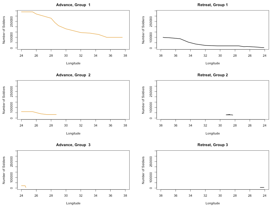
Let’s look at all the data we have for this battle.
We have the numbers of Napoleon’s troops by location (longitude), organized by group and direction. We can plot it on line graphs like so.
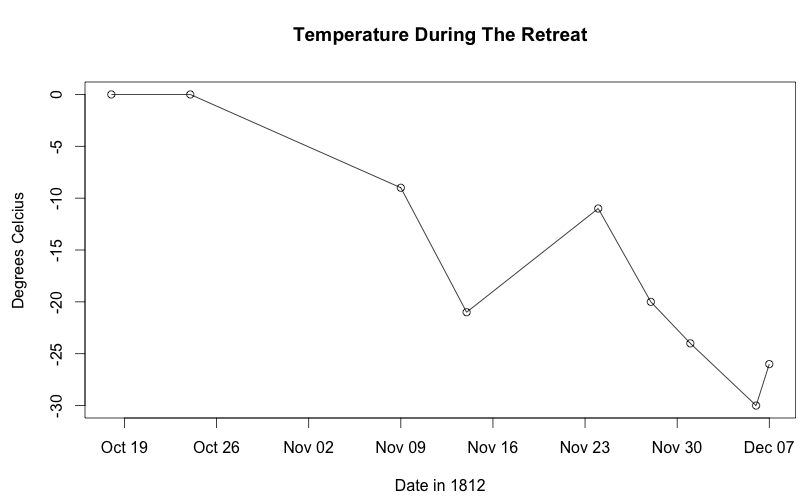
Next, the temperature experienced by his troops when winter settled in on the return trip.
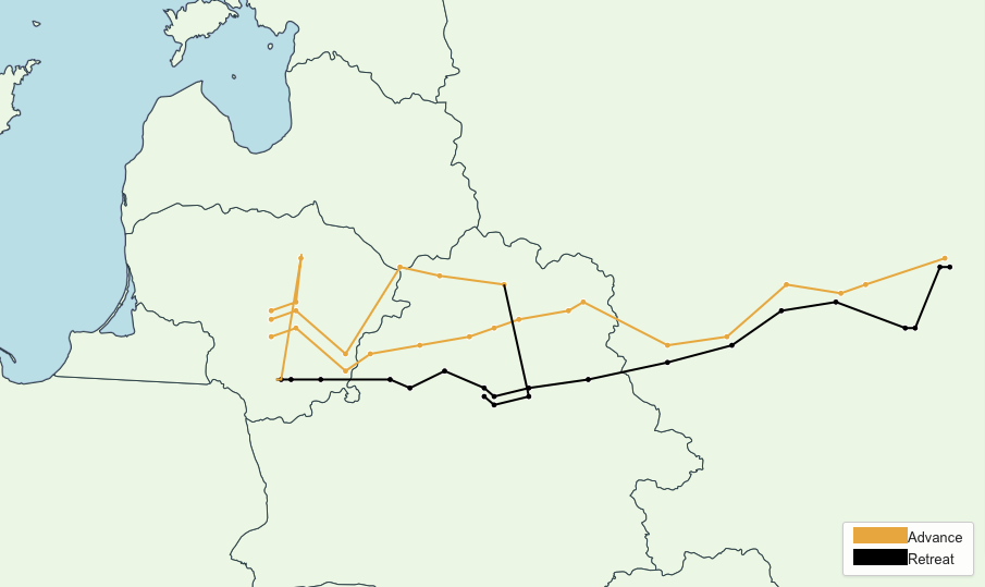
We also have the path that his troops took to and from Moscow. We can display this information by plotting the paths on a map.
Finally, here is Minard’s graphic.
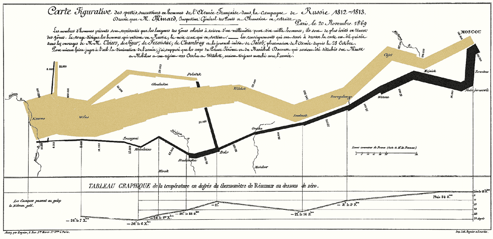
We have many dimensions of data that takes several individual graphs to represent. Minard’s graphic is quite clever because of its ability to combine all of dimensions: loss of life at a time and location, temperature, geography, historical context, into one single graphic. He shows these various details without distracting text or labels as well. For example, he displays the points where Napoleon’s troops divide into subgroups by breaking out the main bar into branches. He adds thin lines to represent river crossings on the return trip that further decimated Napoleon’s diminishing troops. And he is able to show the drastic loss in life from Napoleon’s decision in just a single corner of the diagram.
The beginning of Napoleon’s march vs the end of his retreat.
Equally important as what’s shown is what’s not shown — here’s an earlier example of a well-published data visualization:
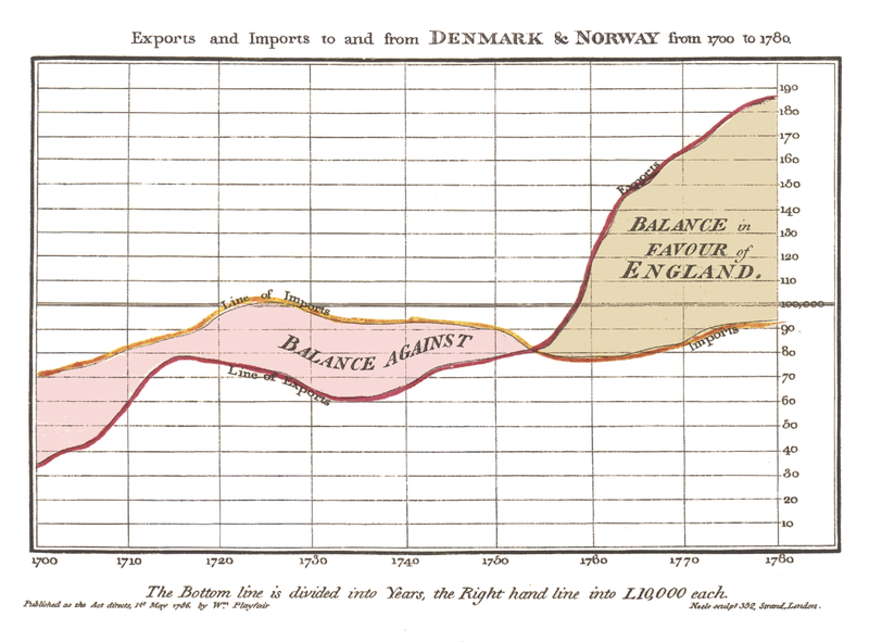
This graphic was created by William Playfair, largely considered to be the father of information design, in 1786 — about 100 years before Minard’s diagram was made. Playfair is the inventor of the pie chart, the bar graph, and the line graph - statistic graphics we use regularly today. This graphic has gridlines to mark the years and the number of exports. There are five colors, each color representing something different, as well as a number of specific labels in large text. Compare this to Minard’s graphic: when he draws the map, there are no geographical borders and only very minimal geographical plotting. There are many labels describing cities and number of troops, but they are very small. Minard only uses two colors to represent all of the data in the graphic. Additional labels, gridlines, and geographical markings would have made the graphic too overwhelming for the eye, which makes the impact of the data so much stronger.
There are some similarities to designing print data graphics and designing modern interfaces for mobile and web. When we need to translate numbers into graphics to users, we want to focus on communicating lots of information without overwhelming the users with extraneous content, much like Minard with his visualization of Napoleon’s March. Both designers created effective graphics to turn numbers into a narrative, but Minard was able to tell a much more detailed story with his design techniques.
What’s next
If you would like to learn more about information design, check out Edward Tufte’s The Visual Display of Quantitative Information or any of his other books. You can also take one of his courses in your city.
You can also read:
- Design for Information by Isabel Merielles
- Data source for analysis
- The R code I used to analyze the data