Balance is great example of how viewers give physical dimensions to non-physical things. Balance is usually described as how “heavy” elements feel to the viewer according to how elements are arranged.
For displaying text, it’s best to provide a comfortable experience for the user to focus on the words. Users don’t want to be constantly distracted by something other than the content, but we can use balance and imbalance to help affect user behaviors and keep things visually interesting.
The most important things that influences visual weight are:
- Contrast and Color
- Texture and patterns
- Identifiable shapes
Contrast is the visual difference between the lightness and darkness of visual elements. If a page has a white background, a black element is going to feel “heavier” than a gray element of the same size, and the opposite is also true for darker colored backgrounds.
Color can have just as much influence on visual weight as contrast does. Remember that colors that invoke action, like red and orange, will draw more attention than calmer colors like blue and green. Choosing an appropriate level of contrast while choosing color palettes and font sizes establishes a proper hierarchy and is essential for accessibility.
You can balance layouts that need to have different size elements by giving one a color that contrasts more with the rest of the page.

Designing for digital devices means that we can’t create physical texture, so we have to simulate it, usually by using an image. Small changes in contrast and the illusion of tactile interaction can help to balance the whole.
People’s brains unconsciously look for identifiable shapes and objects that need special attention. Shapes that draw the most attention are things that look like faces, bodies of humans or animals, letters and symbols. It’s such a hard-wired part of how we process visual information that we tend to see faces that aren’t even there. These shapes grab for our attention in a very different way but will feel “heavier” than something else of a similar size. This comes up when designing areas that pair words and images, like a big “hero” region on a marketing page.
If a design is unbalanced, it grabs for our attention and feels uncomfortable, but sometimes you may want to create tension, like if you are building an exciting and dynamic graphic area. Knowing how to tasetfully bend the rules to create the right level of comfort and tension can make a great design.
Symmetry
Symmetry is the description of how things are balanced, and plays an important part in how comfortable we are looking at content for an extended amount of time.
In the early days of web design, text-heavy content and small screens meant that most web pages were single columns and full-width. As screens got bigger and CSS improved, designs started to borrow from the world of print design to put text in multiple columns and limiting text lines to readable lengths.
The simplest form of symmetry is horizontal symmetry, which is balance between the left and right sides of the image. When we have two sides that are well balanced, it gives the layout a solid foundation and feels very comfortable. This is part of why layouts with a large main column and a smaller side column are so popular, and also why they can feel so uncomfortable when one of those columns is significantly longer than the other.
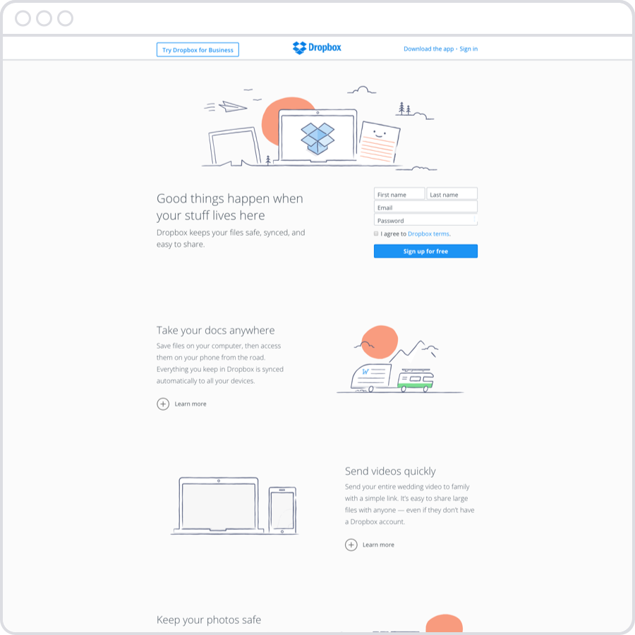
Dropbox uses symmetry to pair descriptive text with a fun illustration to give the impression of simplicity and stability.
The two other types of symmetry are vertical symmetry and rotational (or radial) symmetry. We don’t usually need to think about vertical symmetry in web pages with scrolling content, but it may be necessary to keep in mind for graphics-heavy designs or if the design uses the full area of the viewport. Rotational symmetry is hard to navigate and hierarchy can seem alien and unfamiliar. As you can imagine it is also very difficult to create these kinds of layouts using the grid-based positioning techniques that we use most. An interesting use of rotational symmetry is on the home screen of the Apple Watch, featuring a hexagonal grid. It will be interesting to see if this style will catch on and if the design hurdles can be overcome.
Centered
Centered layouts largely avoid the problems of managing symmetry by offering the simplest possible layout. Whitespace on the left and right sides gives the content some “breathing room” and makes readability much easier. This works best for when you are wanting to showcase your content without any clutter, such as a marketing page, a blog post, or a photo gallery.
Typography and hierarchy become very important and help keep your content from coming across as boring. Centered layouts can feel sparse unless the text is very readable and there is imagery to give the content some personality. Pay extra attention to design for the content that you do have.
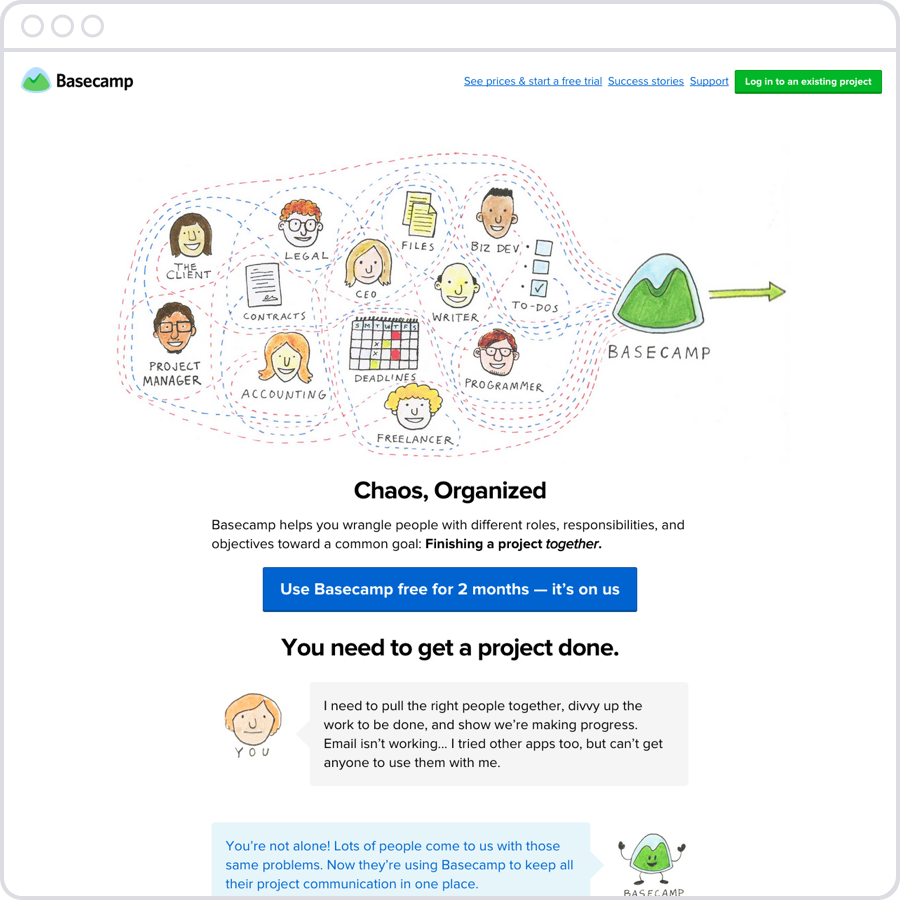
Basecamp redesigns their marketing pages often, doing rigorous testing to ensure that their content makes an impact in a clear and simple way. If you look through their past iterations, the designs become more and more about storytelling. There is a clear progression to each page and there are plenty of options to sign up appearing at regular intervals.

Apple uses a centered layout for similar reasons with their marketing pages, but they have the added challenge of needing to design a multitude of separate product lines while keeping them under the same style guide. Using a centered design helps to make sure that each product gets the readers’ undivided attention and still gives them plenty of room to focus on each feature and story that they want to tell.
Asymmetry

Brands like Rdio purposely tip the viewer off-balance by keeping their layouts mostly asymmmetrical. Lifestyle apps and sports clothing sites often use asymmetry to make the content feel as dynamic as their customers. Music apps have followed in their footsteps and Rdio does a great job using just enough symmetry to make it easy to navigate while creating a fun and chaotic stage for their marketing material. As you might expect, the more text-heavy inner pages do switch to a more traditional two-column layout.