Color is such a fundamental part of how humans understand the world that we often overlook how it is processed and why it influences us.
The how
Humans perceive a small part of the electromagnetic spectrum through our eyes as light, on a scale of frequencies which we call color. Light that has a short frequency is perceived as blue, and a longer frequency is perceived as red. Some humans have a deficiency in the ability to distinguish some colors, so it is important to remember that a discussion about color is about how most humans process light and is necessarily subjective. We will talk about accessibility in relation to color blindness later.

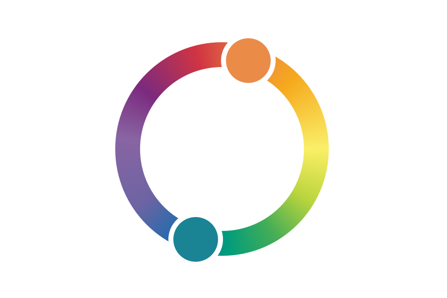
The electromagnetic spectrum doesn’t distribute color quite the same way as a color wheel. That’s because our cone cells are specialized and don’t give us an even sensitivity to light. We are more sensitive to blue, green, and red, and a little less sensitive in between. Our brains also form a smooth continuum between the far left and far right sides to create violet, a trick which works largely because we are least sensitive to that part of the spectrum.

It’s hard for us to distinguish colors where we have fewer receptors. We have trouble seeing the difference between very blue and very red, but it’s also hard for us to see yellow and cyan in some situations.
The color wheel distributes color in a way that emphasizes the parts of the spectrum that we see well and deemphasizes the parts that we are less sensitive to. It’s a truer representation of how our brains interpret and process color, and explains where our color preferences come from and how to think about accessibility for those with color vision deficiencies.
The why
Everyone has a favorite color, but did you know that over 40% of the people in the world prefer blue? Red and green follow at around 10%, and it continues down the secondary colors around 3-4% and tertiary colors around 1-2%. If you look back up to the color sensitivity chart you can probably guess that we prefer colors that we see most clearly.
We associate colors with the real world objects that share that color and with abstract ideas extended from them. Red, yellow, and orange are the color of fire and the hot sun. These are the “warm” colors, and they tend to make us think of action and dynamism. Blue and green are the color of the cool water and grass. These “cool” colors feel reserved and dependable and make people relaxed.
Use these associations to your advantage.
Choosing a color palette
Does your startup offer financial services or do you want your airline to feel safe? Then you’d better use cool colors.
Does your brand target kids, promote sports and health, or just need to set itself apart from the established brand? Warm colors are a good bet.
Using only one color in your palette is called monochrome. This will create the strongest connection to your chosen color, but doesn’t give you a lot of options for design. Popular companies that use this technique successfully with very different colors include Coca-Cola, Chase, and Sprint. It is impossible to think of Coca-Cola without its particular shade of red. These brands try to be unfortgettable by using bold colors and heavy repetition.
You can keep the strong mental associations of a monochromatic color harmony while still branching out to neighboring colors. This is called analagous color harmony, and can help give you more design options.

You might use yellow-orange as a call-to-action color and yellow-green to deemphasize text while adding in yellow as a desaturated khaki for a background color.
The most common color harmony technique is using complementary colors, which are opposite each other on the color wheel.
This is commonly seen in movie posters and in products that try to capitalize on the attention-grabbing nature of contrasting colors to differentiate their product on the shelf. Complementary colors are a sure way to get noticed, but can be hard to work with on pages with a lot of text unless you add in white space or neutral colors.
The triadic color harmony can be used a couple of different ways. You could choose three equally spaced colors, such as the three primary colors, to create a vibrant set of equally strong hues.

You can also move two of the colors closer together to create a sort of blending between analagous and triadic color harmonies. This will give you both a close color relationship and another option for a little extra punch of color.
RGB CMYK HSL HEX WTF
Print designers and other designers that work in inks and pigments deal with CMYK (Cyan/Magenta/Yellow/blacK). This is called reductive color mixing because combining the colors will reflect less and less light until they make black.

Where the primary colors overlap, you will see the familiar red, green and blue as secondary colors.
The model we deal with in light-emitting displays is RGB (Red/Green/Blue). This is additive color mixing because combining all of the colors creates white.

In this case, a combination of red and blue creates magenta.
When we write CSS,
we use a special shorthand
to describe RGB colors called hexadecimal.
Hexadecimal colors are prefixed with #.
Instead of writing the colors as percentages
or on a scale from 255,
we use only two numbers per color
by using pairs of base 16 numbers,
which counts from 0 to 9
and then from A to F.
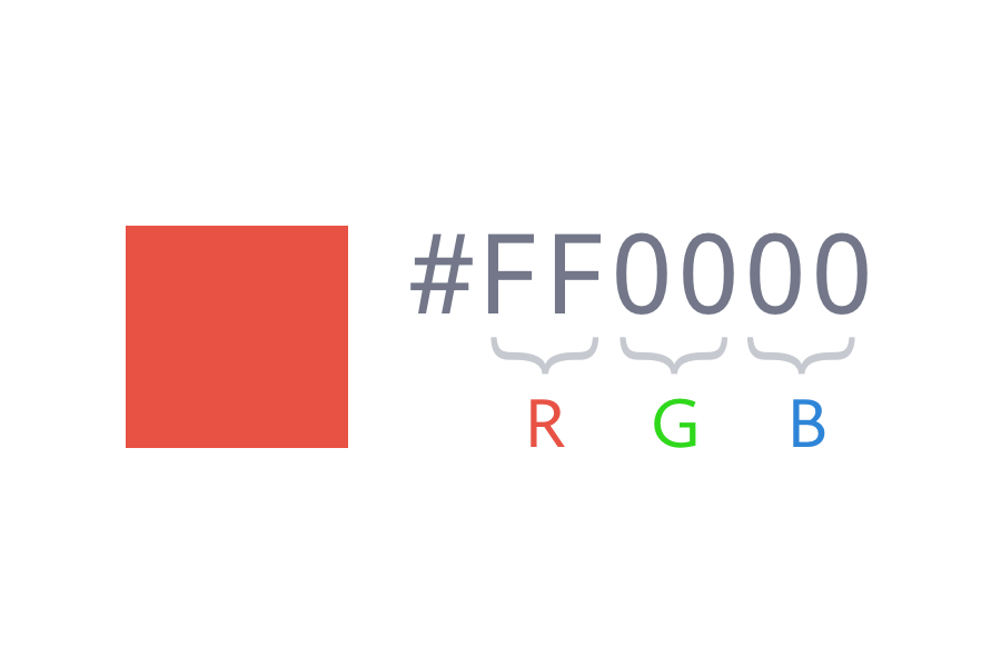
To describe a purely red color,
we would use FF (the highest value)
for the red,
and then 00 (the lowest value)
for both the green and the blue.
A pure black would be #000000,
a nice medium gray is #AAAAAA,
white would be #FFFFFF,
and so on.
You are likely to always have a color picker
close at hand,
so while it is useful
to be able to adjust a color
solely by adjusting the hexadecimal value,
it is best to stick to those helpful tools for now.
CSS3 added in a few more ways to describe color.
You can describe the RGB values directly
by describing that red as rgb(255, 0, 0).
Although it isn’t as widespread,
in some cases it is easier
to use HSL (Hue, Saturation, Lightness)
to describe colors.
That same pure red would be described as hsl(0, 100%, 50%).
The first value is given in degrees
(as in degrees around the color wheel,
starting and ending at red),
the second is that we want full saturation,
and the third is that we do not want it to be tinted or shaded.
Both rgb() and hsl() have accompanying methods
for adding alpha transparency.
For instance, you can use rgba(255, 0, 0, 0.5)
to show red at 50% transparency.