It could be said that an early-stage business has reached product/market fit when it has a trifecta of non-trivial new user growth, retention of those users, and meaningful use by those users where “non-trivial new user growth” and “meaningful use” typically mean something different per-product, defined by a North Star metric.
Retention, though, can be measured in a pretty standard way across products. Many designers, software engineers, and product managers have used cohort reports generated by tools such as Mixpanel or Amplitude or ProfitWell or iTunes Connect Analytics.
Most of the time, these cohort reports come in tabular form. My experience has been that those reports can be confusing. An alternative visualization is a retention curve.
Amplitude provides retention curves for acquisition and behavioral cohorts, so if you’re evaluating tools for your analytics instrumentation, consider choosing Amplitude to get retention curves “out of the box”.
But for those using Mixpanel, let’s generate a retention curve in about 10 minutes using Google Sheets.
We’ll use real data from FormKeep, our product that provides form endpoints for designers and developers, typically working on static sites, who don’t want to fight with trying to style iframes or JavaScript embeds.
Setting up the Curve
Sign into our Mixpanel account. Click “Retention” in the left sidebar. Click “First Time” at the top of the page. For “Show me people who did”, select an activation event such as “Signed Up”. For “Then came back and did”, select a North Star event, the activity where users are getting authentic value from the product. Choose “Day”, “Week”, or “Month” based on the expected frequency of use of that North Star event.
We’ll see a chart that looks something like this:

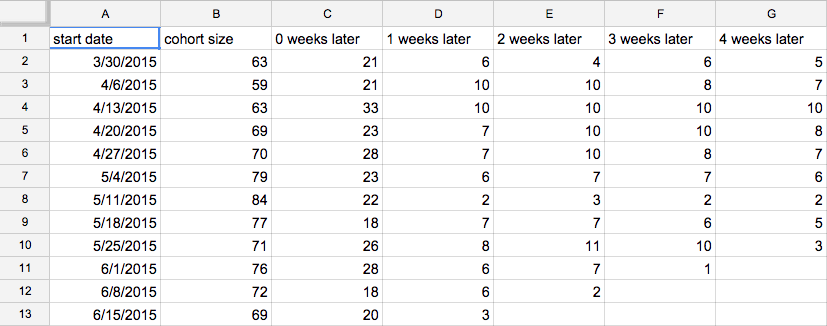
Click the “CSV” download button in the bottom right. Go to Google Sheets. Create a new spreadsheet. Click “File > Import > Upload”. Select the file. Select “Replace spreadsheet”.
We now have a table that looks like this:
Select all the data. Click “Insert > Chart”. Click “Chart types”, “Switch rows / columns”, and the curvy “Line” chart type (for style). Click “Customization” to edit the title.
We now have a chart that looks like this:

We could stop there if we wanted, but there’s one small information design improvement we can make. We’ll select each time series, and pick a shade of color in the same column, making the oldest time series the lightest shade.
In this case, we’ll choose the lightest shade of blue, named “light cornflower blue 3” (obvi):

The goal of this shading to create a relationship between the series. Darker is more recent (“fresh paint”) and lighter is older (“faded”).
Here’s our final result:

Analyzing FormKeep’s curves
We want to see our curves flattening out and the initial drop-off (present in every product’s activation funnel) to be shallow. We want to see the darker-colored lines (more recent cohorts) flattening sooner, for longer, and a higher absolute amount, than lighter-colored lines (older cohorts).
FormKeep’s curves are experiencing a sharp drop-off in the first two weeks. The people who do activate, stay activated for months, though. So, we should work on better activation to set our users up for success.
This isn’t super-surprising. FormKeep is a “free to sign up” product that require some set up (HTML to be added to a site) to activate.
Analyzing Upcase’s curves
Let’s compare the retention curves of another real product, Upcase, our online training community for programmers, using green lines instead of blue lines, for giggles:

The initial drop-off in usage is shallower than FormKeep’s. Where FormKeep’s cohorts are closer to 10% active in weeks one and two, Upcase’s cohorts are more like 30-40% active in weeks one and two.
There is a trend of older cohorts stopping use of the product 3-4 weeks after subscribing, and recent cohorts sticking around a bit longer, closer to 6 weeks. This is good news, and validates our recent focus on content production.
Unlike FormKeep, Upcase is “pay to sign up”, so we’d intuitively expect more motivated users, especially in the first month.
Time to segment
These charts give us a scorecard, but also some clues about where to dig for more data.
For example, we might want to be adjust our Intercom communication to users around week 1 and week 2.
It’s also a reminder that the more properties we send to Mixpanel (via Segment) for our activation event, the more information we have on different segments, which could give us other clues about who is and isn’t getting value. Click “+ Segment” in Mixpanel and choose an important property to segment by, such as user acquisition channel:

The results:

Curves are cool
I find this way of visualizing cohort reports easier to understand than the tabular form. It’s a bit of manual work right now but perhaps Mixpanel, Apple, and others will begin offering a retention curve representation in the future.
Happy retaining!