Typography has a very long history, from ink and brush through the printing press, but type on the web starts with the advent of digital type. A “typeface” is a group of all the letters of a specific family, style, and weight, like “Helvetica Bold Italic”. A “font” is a file that contains the typeface. When we’re talking about digital usage, these terms are fairly interchangeable, so don’t feel bad about getting them mixed up. We’ll mostly be talking about Latin typefaces (for languages with letters like English), but there is a whole wide world of categories and details for other languages that I encourage you to explore.
Early fonts were simple bitmap images of each character very quickly became the vectorized shapes that we know and use today. These scale better, obviously, but the vector format also allows for better control over what are essentially just elaborate shapes. In some ways, the details of those shapes matter so much more in typography than in iconography or illustration because they form the personality and voice of the content.
Even though the computer revolutionized the way we create and use typefaces, you’d be surprised how little has changed in the styles and categories of type. The anatomy of the characters, the names we give typefaces, and the terminology around how they work almost all go back hundreds of years or more. There’s a lot of terminology to learn if you’re going to impress your designer friends, so let’s get down to it.
Parts of a Typeface
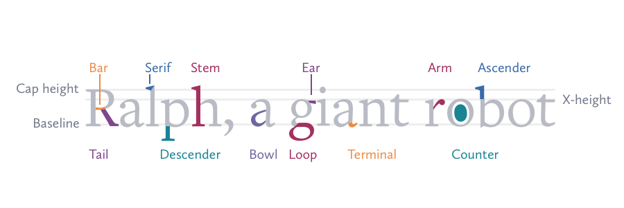
- X-height: The height of lowercase letters like x, a, e, and o, not including ascenders and descenders.
- Cap Height: The height of capital letters from a baseline to the top of character.
- Baseline: The invisible line that guides the characters and forms the bottom of the x-height.
- Ascender: Part of a character that raises above the x-height. Typically seen in b, d, f, h, k, l, t.
- Descender: Part of the character that drops below the x-height. Typically seen in g, j, p, q, y, and sometimes J.
- Serif: The projections off of the ends of a stroke in serif typefaces.
- Arm/leg: An upward or downward stroke connected on one end.
- Bar: The horizontal stroke in characters like A, H, and e.
- Bowl: A curved stroke that encloses a space inside the character. This empty space is called a counter.
- Ear: A small stroke that extends from the top of the lowercase g and sometimes r.
- Loop: The lower portion of a lowercase g and some cursive letters with descenders.
- Stem: A vertical stroke that typically forms the main structure of a character.
- Shoulder: The curved stroke moving downward in letters like h, and n.
- Tail: The diagonal descending stroke of a Q, K and R, or on lowercase letters like g and y.
- Terminal: The end of a stroke that does not have a serif.
Types of Type
Serifs
Serif typefaces have a very long history, starting in ancient Rome where they were commonly carved or written with pen and ink. Serifs are the flat ends that are added to the ends of certain strokes, which aids in legibility and also serves to tidy the rough stroke ends when using these primitive writing techniques. These features were used in various kinds of writing systems for thousands of years, and they aren’t going away any time soon.

Types of serifs:
- Old-style: Patterned after the origin types of ancient Rome, these classic types feature brackets and some small variation in stroke weight.
- Slab serif: Developed as a more modern type, these feature no bracketing, little change in stroke weight, and otherwise resemble geometric sans-serif types.
- Transitional: A mixture of old-style and neoclassical designs, these types tend to be more geometric and regular but still feature bracket serifs.
Because of their classical roots, serif typefaces are associated with tradition and stability, so serifs in branding are particularly popular in the finance, education, and publishing industries. Serif typefaces haven’t received as much appreciation as those without serifs, but they have too rich a history and too many strengths to ignore.
They give a visual anchor to the characters that make them feel sturdy and solid. Serifs can also seem cold and imposing, but leveraging their good qualities can give a professional and trustworthy impression. They also improve legibility of long strings of text, giving the eye some stability as the serifs differentiate similar characters. So if you are designing for news articles, books or something dominated by lots of text, buck the trend and pick a nice serif.
Sans-serifs
Sans-serif types are a much more recent development relative to the long history of type. They became popular around the start of the 1800s and coincided with the start of modernism. Like we discussed with abstraction, design was moving toward a universal style and focusing on human-centered thinking. Sans-serif typefaces strip down the traditional letterforms to their essential parts, and are usually classified according to how far they take that goal.

Sans-serif fonts come in a few different classifications:
- Grotesque: These were some of the first sans-serifs and carry over some serif heritage, including bowls on the “g” shapes and some variation in stroke weight.
- Geometric: Simple shapes and consistent stroke weights make this the most minimal of types, but also one of the least legible.
- Humanist: These types take the best from both serif and sans-serif characteristics, and are geared for maximum legibility.
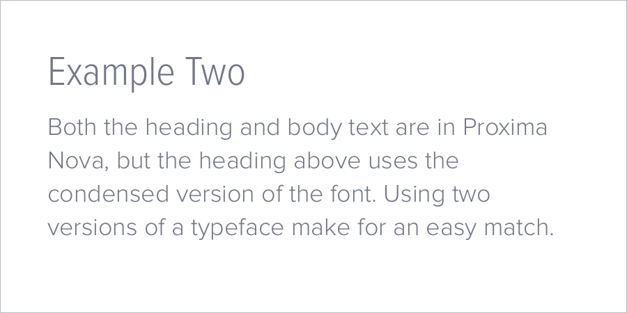
Popular sans-serif typefaces like Helvetica, Proxima Nova, and Open Sans are everywhere on the web these days because they fit right in with the modern aesthetic. That makes them a great choice for branding, marketing and user interfaces, but because they’re so ubiquitous they may not have the kind of impact you want. The typeface that you choose can have a big impact on your web project, so take the time to make sure the typeface you have in mind has a personality that matches your project’s personality. If you can’t decide between a serif and sans-serif typeface, don’t worry, we’ll cover combining typefaces in a bit.
Display
Display typefaces are meant to grab attention. Some look like various forms of handwriting, others are more graphical, and some push the limits of what a typeface can be. The typefaces vary wildly, so categories of display typefaces are more about style than specific anatomical parts.

- Calligraphic - As the name suggests, these are based on handwriting and calligraphy, with large loops alongside shapes that look much like italicised serif characters.
- Formal Script - Less regular but also sometimes more formal than Calligraphic typefaces, Formal Scripts are modeled after classic cursive handwriting.
- Casual Script - Even more varied, these look more like the scrawled handwriting that most of us use every day, but also covers the kind of hand-painted letters you might see on shop window signage.
- Blackletter - A style of calligraphy popularized in Germany and was widespread in Middle Ages Europe. Extremely traditional and heavy, usually featuring ligatures.
- Decorative - Any typeface that doesn’t fit in one of the categories we’ve described already but are recognizable as letters. It’s the junk drawer of typeface classification reserved for the especially wacky.
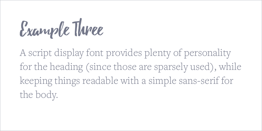
While many of them have classical roots in calligraphy and formal handwriting, these days display typefaces are mostly used sparingly for visual impact, taking advantage of their interesting visual characteristics. You will find display fonts used in brands and marketing, but they’re not likely to show up in a user interface elements or long-form articles. Sometimes you need the big guns, just be sure you use them responsibly.
A quick note about other languages
Serif and sans-serif types appear in other writing systems too, not just the Latin alphabet, and are classified with many of the same terms. Try out your favorite serif font with support for Greek and Cyrillic characters and you probably won’t be too surprised to see that the characters look very similar to their Latin counterparts. Chinese and Japanese typefaces can have the same features with the same features even though they have a very different history. The digital age has influenced the styles of these different writing systems and the more they are used in combination with western type, the more obvious the influence becomes.

Pairing Typefaces
Now that we know the strengths and weaknesses of these kinds of typefaces, we can use each to its advantages. There’s absolutely no reason to stick to just serifs or just sans-serifs, so use whatever combination fits your brand the best.
Combining typefaces isn’t easy, and deserves some careful consideration of their parts to create a theme, and gives your project a much more unique look than you can get from one typeface alone. One of the typefaces you choose should be chosen as the foundation. I recommend starting with your body text, since this will probably be the simplest typeface to choose and arguably is the most important. Use the characteristics like a large or small x-height, the angle of the stems, and roundness of the bowls to build your other other typefaces around.
If you want some variety, but the idea of picking out specific typefaces gives you a panic attack, you can ease into things by sticking to one typeface family. Some typefaces will include a few variations that are all related (like “Tungsten”, “Tungsten Narrow”, and “Tungsten Rounded”). They were designed by the same type foundry to work well together, and give you just enough variation without worrying about the details.

The most common typeface pairing on the web is to match a serif for headings and a sans-serif for body text. It’s hard to go wrong with this combination, especially if you find a set from a foundry designed to work together. I like to make sure there’s a mixture of similar and disparate elements between them to provide a good balance.
Still too boring? See how far you can push things by bringing in some display typefaces or combining 3 or more fonts. Just keep in mind that your different font treatments should communicate to the user what the purpose of that text is, so if you have headings in more than one typeface or your UI elements don’t look similar, it will be confusing.
Symbol and Icon Fonts
There’s one more category of font that almost doesn’t count as a typeface, but is very useful on the web. Symbol and Icon fonts are packaged just like other fonts, but they aren’t used for the same purpose at all. Symbols have always been used in combination with writing, so it makes sense to have fonts for this purpose (remember Wingdings?). On the web they have been adapted to provide icons for user interface elements where creating individual image assets would be a hassle. This also gives them the advantage of being easy to style in CSS just like fonts, and icon sets can come prepackaged as font files to make it easy to keep your symbols consistent.
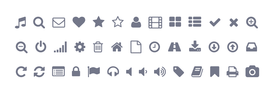
The example below is simply single characters of the font, just like you might type out a sentence, but what you get back is a collection of symbols instead. As you can imagine, this would be a terrible way to use an icon font (“What was ‘q’ again?”), so they usually come with a CSS stylesheet as well so you can just add a class to an element and the stylesheet will take care of adding the icon for you. All you would have to do is something like this:
<i class="fa fa-question-circle-o"></i>
This is an example from Font Awesome,
which cleverly uses the <i> tag
not to mean italics (as originally intended),
but to imply icon.
Because icon fonts are so easy to implement this way,
icon fonts have become very popular among developers
and people who don’t want the mess
of styling image icons.
If you have an app project that will make heavy use of symbols,
icon fonts can be a great choice.
There are more
than a few great Icon Fonts
to choose from.
As we’ll discuss in the next section, Icon Fonts can create a performance problem by being yet another asset to fetch from your server, so you’ll have to weight the pros and cons for your particular project whether it’s worth it to use a font or something fancier like [inline SVG icons] instead.
Font Performance
The ability to easily use web fonts with CSS has improved dramatically over the last few years, but because these depend on loading files into the browser after the page loads there are some performance issues to consider. Maybe more importantly for the design, it can lead to a momentary delay where your preferred font isn’t loaded and the dreaded “Flash of Unstyled Text” creates a jarring effect for your user.
There are a few ways to combat this:
- Use a hosted service like Google Fonts or Typekit for your typefaces.
- Make sure you’re doing everything you can to optimize and cache your locally hosted fonts.
- Make sure your fonts get loaded before other blocking scripts that could be loaded later.
- Use some fancy JavaScript to hide the text until the font is loaded.
I suggest using a service like Google Fonts or Typekit for your typefaces (especially if they happen to be freely hosted by Google). This means not having to host it yourself and they have easy integration instructions. The biggest benefit though is that there’s a decent chance your user has already come across this asset on another website and will have it cached in their browser. Not having to make another request for the font file will speed up the page load, and the font will load almost instantly if it’s in cache.